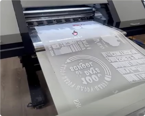
Why File Prep Determines Print Quality
A beautiful design on screen doesn't guarantee a beautiful transfer. That goes wrong almost always in the file setup, before the print even starts. Whether you're a print shop running daily orders, an apparel brand launching a drop, or an Etsy seller uploading your first design, the file you send us matters more than the design sitting inside it. Get the setup wrong, and even great artwork comes out soft, dull, or off-color.
Understanding DTF File Requirements at a Glance
Here's the checklist worth bookmarking before we get into the weeds: 300 DPI at final print size, a canvas built to actual dimensions, a transparent background, RGB color mode, and text converted to outlines. If you only take one thing from this post, take that list.
Resolution & DPI: Why 300 DPI at Final Size Matters
DPI measures pixel density relative to your physical print size, not just total pixel count. A 4"x4" design needs at least 1,200 x 1,200 pixels to hit 300 DPI. Stretch that same file to 10"x10" and the effective resolution drops to around 120 DPI. The print looks noticeably soft, even though the file's pixel count didn't change.
There's some wiggle room. Large-format prints viewed from a distance oversized back designs, banners can often get away with 200-250 DPI, since fine detail matters less at that range. What doesn't work is upscaling a low-res image and hoping it sharpens up. Stretching pixels doesn't create detail. It just makes the blur bigger.
Color Profiles: RGB vs. CMYK for DTF Printing
This trips up a lot of designers, since it runs against everything they learned about traditional print. DTF printers lay down CMYK plus white ink on the film, yet most DTF RIP software expects an RGB file. The RIP handles that CMYK conversion internally, and it does it better than most design programs do on their own, with a wider color range and more accurate results.
One practical tip: DTF ink can't always hit the full RGB gamut, especially with neon pink, green, or bright orange. Check your brightest colors against a reference chart before finalizing, so you know what will look like on fabric instead of what your bright monitor shows you.
File Format & Transparency: Setting Up the Background Correctly
PNG-24 with a transparent background is the standard for DTF work. PDF works well too, especially for vector-based or text-heavy designs, since it holds sharp edges at any scale.
Quick test: open your file and look for the checkerboard pattern where the background should be. Checkerboard means real transparency. Solid white usually means a white layer is sitting at zero opacity; it looks identical on screen but prints as an opaque white patch on the garment. That one mix-up causes more reprints than anything else on this list.
Text, Vectors & Other File Prep Essentials
Convert your text to outlines before exporting. A missing font on our end shouldn't be substituting something you never designed into your artwork. Use vector formats AI, EPS, SVG for logos and line-based work whenever you've got them, since vectors scale without losing anything. And don't pre-mirror your artwork; the RIP software does that automatically, so a file mirrored twice prints backward on the garment
Common File Mistakes That Ruin DTF Transfers
Most rejected or reprinted files come down to a handful of repeat offenders: a logo pulled from a website or a screenshot (web images run 72-96 DPI and print visibly blurry), a file built smaller than the intended print size and scaled up after the fact, glows or feathered shadows that rely on semi-transparent pixels and either drop out or print muddy, or a white background layer standing in for real transparency.
Get the File Right, Get the Print Right the First Time
Nothing else in the DTF process matters more than the file itself. Press settings and curing temperature count, sure, but neither one can save a file that started with the wrong resolution or a hidden white background. Ready to submit your artwork? Upload your ready file or build a gang sheet, and if anything looks off, give us a call before you order; we're happy to take a quick look first.
FAQ
1. What DPI do I need for a DTF transfer?
300 DPI at your final print size is the standard target. Large-format prints viewed from a distance can sometimes get by at 200-250 DPI.
2. Should my file be RGB or CMYK for DTF printing?
RGB. Our RIP software converts from RGB and gets a more accurate color than a file you've already converted to CMYK yourself.
3. What file format works best for DTF printing?
A transparent PNG-24 covers most jobs. PDF works well too, especially for vector-based or text-heavy designs.
4. Can I use a logo I found online for my DTF transfer?
Not usually. Web images typically run at 72- 96 DPI, which prints blurry. Track down the original high-resolution or vector file instead.
5. Why does my transparent background show up as white?
Usually a white layer is set to zero opacity instead of being truly deleted. Look for the checkerboard pattern in your design software to confirm it's actually transparent.
6. Do I need to convert text to outlines before submitting my file?
Yes. It prevents font substitution, which is one of the most common reasons a transfer comes back looking almost right instead of exactly right.